‘Join the ATS’ by Abram Games to Massachusetts USA

'Join the ATS' by Abram Games, British Poster, 1941, Postcard Print © Imperial War Museum (Art, IWM PST 2823)

Fig 1. ‘Join the ATS’ by Abram Games, British Poster, 1941, Postcard Print © Imperial War Museum (Art, IWM PST 2823)

Today I replied to my pen pal Dan after receiving his fantastic postcard of the cave paintings of Dordogne, which you can see here and includes some truly wonderful expressionist art stamps.

This is my third postcard to Dan, but unfortunately this is the only one I have made a scan from. We are currently exchanging artist postcards, which has been fantastic for learning about different artists and exploring different styles and movements.

This postcard, featuring a print of a wartime poster by Abram Games was purchased from the Imperial War Museum, which is only a 10 minute walk from my home. I love graphic design, and work from this era can be so beautiful.

Abram Games (1914-1996) was born in Whitechapel, London, and was a British graphic designer. Born the day after WW1 started, it can be considered that Games was a true child of war. After dropping out of Saint Martin’s School of Art, and getting fired from his job at the design firm Askew-Young, it wasn’t until 1935 that his career really began when he won a poster competition for the London City Council. He landed several high profile commissions following a feature in the Art and Industry journal in 1937, including the Post Office and London Transport.

Games knew the impact his work could have on it’s audience, especially during wartime Britain, and describes his communicative influence as

‘I wind the spring and the public, in looking at the poster, will have that spring released in its mind’

Games served in WW2 until 1941, when he was enlisted as the official poster designer for the British Army, and subsequently created over 100 posters.

Games’ work spans over six decade, and is seen as a documentation of the era’s social history. His work contains bold colours, striking visuals and sophisticated modern typography.

The iconic poster shown in fig 1 was known as the blonde bombshell, however, the poster was later withdrawn over concerns that it would recruit women into the ATS for the wrong reasons, due to it’s glamorous qualities.

My favourites from Abram Games

This postcard was sent on Tuesday 29th March 2016.

From the Cave Paintings of Dordogne to the Great Abstract Expressionists of America

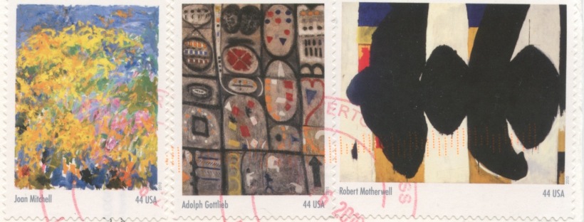
Today I received my third postcard from my direct swap buddy, Dan from Watertown Massachusetts. I love receiving postcards from Dan, he always uses wonderful stamps featuring famous works of art; this postcards features stamps from Joan Mitchell, Adolph Gottlieb and Robert Motherwell.

The front of the postcard features the cave paintings of Grotte de Font de Gaume, DordogneI didn’t really know anything about these cave paintings until receiving this postcard from Dan, postcrossing is such a fantastic way of learning about the world – and this is especially compelling when art work is involved.

USDAN3F

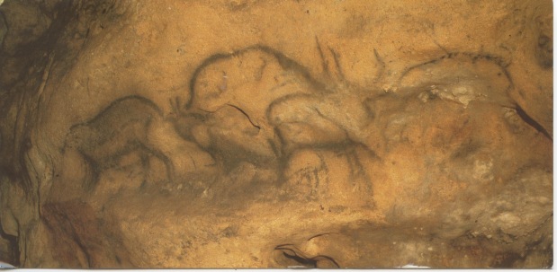
Fig 1. Grotte de Font de Gaume, Les Eyzies de Tayac, Dordogne, France

Dan tells me that these paintings were produced over 30,000 years ago, and he writes that this postcard ‘celebrates an unknown master artist’ which is a marvellous way of putting it. Dan tells me how he was mesmerised when experiencing these paintings, and I am truly inspired to visit this part of France and see the cave paintings for myself.

However, when visiting Les Eyzies website, they explain that there are reduced numbers allowed into the caves now, and that in future years the caves may no longer be viewable by the general public for conservation reasons. I hope I can see these historical wonders before it is too late!

The website describes the cave paintings as follows:

Discovered in 1901 by D. Peyrony, the Cave, 130 m long, contains about 250 paintings. The visitor can only see 30 of them, the most beautiful ones and the best preserved. After 60 m underground, the “Rubicon” is the beginning of the decorated part of the cave, with red dots on the left wall. These caves were not used as dwellings, they were shrines, according to A. Leroi-Gourhan The Grotte de Font-de-Gaume is famous for its cave paintings from the Magdalénien period. It is entrance is 20 m above the valley floor of the Beune valley, at the lower edege of a huge limestone rock.

There are many polychrome paintings and some engravings. The 240 figures show 80 bisons, which are the dominant motive. Most other pictures are also animals, 40 mammoths, 23 horses, 17 reindeers and deer, eight primitive cow, four goats, a wolf, a bear, and two rhinoceroses. More interesting, but less frequent, are four hand outlines and 19 geometric figures.

Have you every visited the cave paintings in Dordogne? I’d love to hear about your experience.

Back to the stamps

USDAN3B stamp

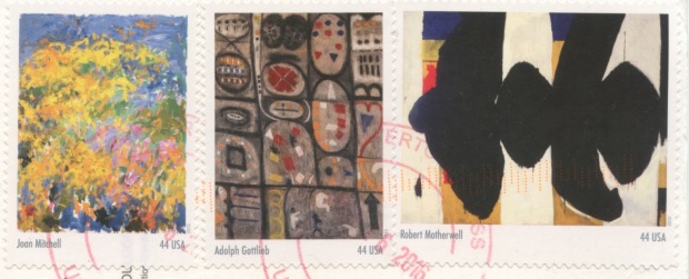
Fig 2. Stamps featuring the work of Joan Mitchell, Adolph Gottlieb and Robert Motherwell

As I mentioned before, I adore the stamps that Dan uses on his postcards to me, I am always seeking equally wonderful stamps that I can use on my postcards in return, but they are simply not as impressive. The Tate stamps I have been using only depict the architecture of the Tate Modern, which is disappointing, and slightly uninspiring, and nowhere near as evocative of these stamps showing works of art. Here is some information about these artists.

Joan Mitchell (1925-1992)

Mitchell is known as a second generation abstract expressionist painter and printmaker. Although much of her career took place in

joan_mitchell_-_no_birds

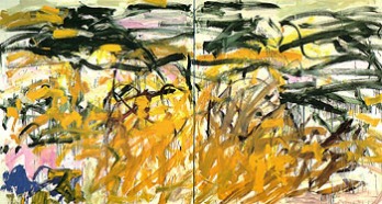
Fig 3. Joan Mitchell No Birds (1987/88)

France, she was very much part of the American Expressionist movement. Mitchell was one of the few well-known female painters of the era.


Mitchell’s paintings are often considerable size, frequently taking over two panels. Focusing primarily on landscapes, her style is gestural and often violently so, and she described her paintings as ‘an organism that turns in space’.

Mitchell’s painting No Birds (1987/88) in said to have been painted in homage to Vincent Van Gogh, in particularly to his painting Wheatfield with Crows (1890) which Mitchell observed as being Van Gogh’s suicide note.

2560px-a_vincent_van_gogh

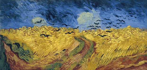
Fig 4. Vincent Van Gogh Wheatfield with Crows (1890)

Adolph Gottlieb (1903-1974)

w1siziisijiwntizmsjdlfsiccisimnvbnzlcnqilcitcmvzaxplidiwmdb4mjawmfx1mdazzsjdxq

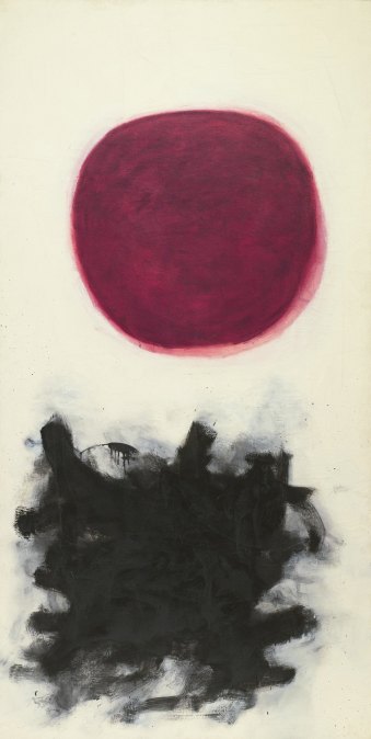
Fig 5. Adolph Gottlieb, Blast, I (1957)

Gottlieb was an American painter and sculptor who predominantly worked in New York. In June 1943, Gottlieb and Rothko together wrote a letter to the New York Times outlining their theoretical outline of Abstract Expressionism.

Gottlieb’s style took the form of pictographs, with reference to timeless, primitive images, it was his aim to formulate a universal grammar common to all humanity. By the 1950’s Gottlieb had moved towards a series of Imaginary landscapes, consisting of radically simplified imagery.

The work Blast, I (1957) seen in fig 5 is one of my favourite Gottlieb pieces. The simplification of the landscape forms is entirely satisfying visually.

Robert Motherwell (1915-1991)

Motherwell was also an American Abstract Expressionist painter, as well as an editor, writer and teacher. In 1932 he briefly studied painting at the California School of Fine Arts, but soon pursued a degree in Philosophy at Stanford University, and later Art History at Columbia University. It was only after this Motherwell returned to painting, and was associated with the New York Surrealists, and experimented with the use of automatism; the accessing of material from the subconscious or unconscious mind as part of the creative process.

Elegy to the Spanish Republic #132 1975-85 by Robert Motherwell 1915-1991

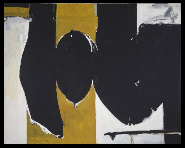
Fig 6. Robert Motherwell, Elegy to the Spanish Republic #132 (1975-85)

Continue reading

Jeff Koons to Argentina

SWAP- GABRIELA ARRIETA F

I was recently approached for a direct swap with a girl from Argentina, she is an art student and interested in swapping artists postcards. Of course this is totally up my street!

I have had this Jeff Koons postcard for a while now. I don’t just send my artist postcards to anyone, it has to be to someone I know will appreciate it. I really enjoy the playfully kitsch nature of Koons’ work, and was excited to send it to my new pen pal across the Atlantic. I can’t wait to receive her postcard to me!

Jeff Koons (1955-)

Koons is an American artist who’s work encapsulates popular culture, and creates reproductions of banal objects, most famously his oversized stainless steel balloon animals. His work has broken records for the largest price sold at auction by a living artist, with Koon’s Balloon Dog (Orange) selling for $58m.4. Koons states that is work contains no hidden meanings, and is often critiqued for being kitsch, but it is this quality that draws many, like my self to enjoy his work.

An Oldie from Germany

Today I received a great postcard from Germany, I love vintage photographs and postcards, and this one is gorgeous.

DE5096662F

After some research I discovered that the photograph is of German actress Grethe Weiser (February 27, 1903 – October 2, 1970). She started her career in the 1920s cabaret scene in Berlin, and went on to appear in around 30 movies.

DE5096662B stamp

Interestingly, Grethe spent her childhood in Dresden, and coincidently the stamp on this postcard displays the Dresden Elbpanorama. What a fantastic stamp! I love ones with  non-standard dimensions.

A Martin Parr-esque Beach Scence from Germany

DE5057960F

There is something very Martin Parr about this postcard from Haan in Germany, illustrating a beach scene in Dahme, off the Baltic Sea.

It reminds me somewhat of the great British holiday, with the huts, though we would be lucky to see such fantastic blue skies. It is the bold, high-contrast colours combined with the kitsch nature of this postcard that makes me thing of Martin Parr, a British photographer known for photographing scenes from the everyday.

ARGENTINA. Mar Del Plata. Grandé Beach. 2014.

Martin Parr, ‘Mar del Plata’ 2014. http://www.martinparr.com/2014/mar-del-plata/

This photograph is from Parr’s Mar del Plata series. The resort is located in Argentina and is vast, the 16km of beach attracts over 7 million visitors a year, and is lined by 2000 hotels. The high contrast colours are also evident here, and the busyness of the beach is much like the Dahme postcard, except on acid.

Unfortunately the photographer and date of the postcard is unknown, and not printed on the postcard, and doesn’t bring up any matching photographs when searched by image on Google.